Knowledge Base
Solution 25330: Graphing a Histogram (Bar Graph) Using the TI-Nspire™ Family Products.
How do I graph a histogram using TI-Nspire family products?
Use the following example to graph a histogram with a frequency list on the TI-Nspire family products:
Data used for this example:
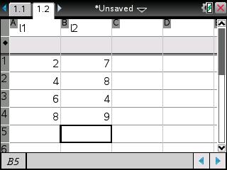
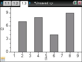
xStat: {2, 4, 6, 8} frequency: {7, 8, 4, 9}
Enter the data:
• Press [home] and click on Lists & Spreadsheets.
• Press [↑] [↑] [L] [1] [tab] [L] [2] [enter] to name Column A L1 and Column B L2.
• Press [←] [↓] to get to L1's entry line.
• Press [2] [enter] [4] [enter] [6] [enter] [8] [enter].
• Press [→] and then [↑] four times.
• Press [7] [enter] [8] [enter] [4] [enter] [9] [enter].
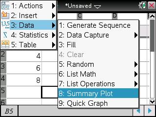
• Press [menu] [3] [8].
• Press [→] and select L1 if X List does not have L1
• Press [tab] and ensure that Summary List is L2, if it is not press [→] and then choose L2.
• Press [tab] and choose the where to display the Summary Plot. Please note that for this example, New Page was chosen.
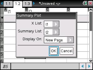
• Press [tab] [enter].
Please reference the TI-Nspire family guidebooks for additional information.