
Looking Normal
Math: Statistics: Normal Distributions
9-12
45 Minutes
TI-Nspire™ CX series
TI-Nspire™ CX CAS/CX II CAS
3.0
Lessons
TNS
Looking Normal
Activity Overview
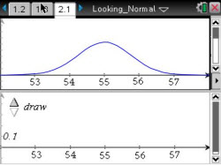
This lesson involves examining multiple samples taken from a single approximately normal population.
Objectives
- Students will recognize that the shape of the distribution for a single sample varies from sample to sample, even when all the samples come from the same population.
- Students will recognize that the variability in shape from sample to sample decreases as sample size increases.
- Students will recognize that larger samples from an approximately normal population will more often "look" normal than will smaller samples from the same population.
Vocabulary
- dot plot
- histogram
- normal distribution
- normal probability plot (NPP)
- population
- sample
About the Lesson
This lesson involves examining multiple samples taken from a single approximately normal population.
As a result, students will:
- Compare dot plots, histograms, and normal probability plots to determine which representation best provides information about the normality of a distribution.
- Select multiple samples of the same size to discover that not all samples from a normal population actually look normal.
- Change sample size to compare the shapes of larger samples to those of smaller samples.
Download Files
Math: Statistics: Normal Distributions
9-12
45 Minutes
TI-Nspire™ CX series
TI-Nspire™ CX CAS/CX II CAS
3.0
Lessons
TNS
iPad is a trademark of Apple Inc., registered in the U.S. and other countries.
Vernier EasyData,Vernier EasyLink and Vernier EasyTemp are registered trademarks of Vernier Science Education.
Vernier EasyData,Vernier EasyLink and Vernier EasyTemp are registered trademarks of Vernier Science Education.