Education Technology

Statistics and Probability / Analyzing Distributions

Grade Level 6
Activity 9 of 24
In this lesson, students associate distributions with appropriate measures of center and spread.

Planning and Resources

Objectives
Students recognize the advantages and disadvantages of different graphical representations and can use each to compare measures of center and spread for a given distribution.

Vocabulary
histogram
dot plot
box plot
bar graph
symmetric
skewed
mound shaped
bimodal


Standard: Search Standards Alignment

Downloads

Lesson Snapshot

Understanding

Students should recognize that in a bar graph, bars represent quantitative measures associated with categorical data. Whereas, the bars in histograms represent frequencies associated with quantitative values.

What to look for

Students consider what they can learn from different representations of the same data using a dot plot, a box plot and a histogram.

Sample Assessment

Which of the segments represents the median and IQR?

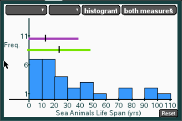
Answer: The shorter segment that goes from 0 to just less than 40 because the distribution is skewed, the median is not in the center of the segment

The Big Idea

Students consider what they can learn from different representations of the same data using a dot plot, a box plot and a histogram.

What are the students doing?

Students investigate whether the mean or the median is a more useful measure of center, taking into account the shape and symmetry of the distribution.

What is the teacher doing?

Encourage students to think about the MAD in terms of deviations (distance) from the mean, while the IQR is based on order alone not on the weight of the actual values in the distribution.