You can sort and group data using the categorical plot types:
• | Dot Chart |
• | Bar Chart |
• | Pie Chart |
The categorical plot types can be used to compare the representations of data across different plots. When the same variable (list) is used for a dot chart and a bar chart or pie chart in a problem, selecting a data point or segment in one of the plots selects the corresponding data point, segment, or bar in all other plots that include the variable.
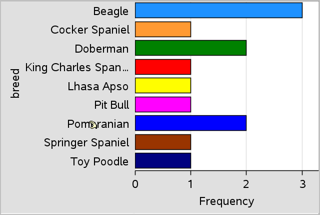
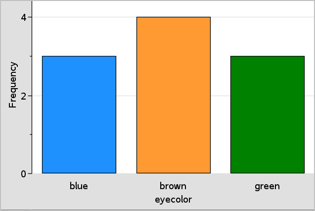
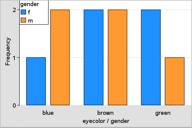
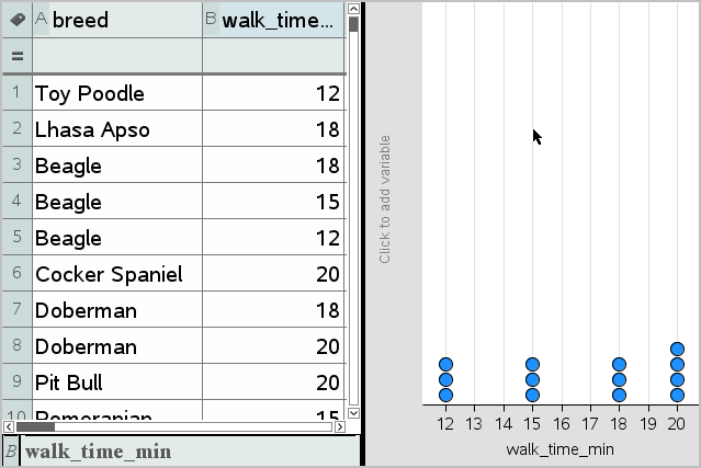
The default plot type for categorical data is the dot chart.
When one variable is plotted, the value of each cell is represented as one dot, and the dots are stacked at the point on the axis that corresponds to the cell value.
1. | In Lists & Spreadsheet, create a spreadsheet that includes at least one column of string values that can be used as categories for data. |
Note: To type a string in Lists & Spreadsheet, enclose the characters in quotes.
2. | Add a Data & Statistics page to the problem. |
Notes:
- | You can also use the Lists & Spreadsheet Quick Graph tool to automatically add a Data & Statistics page and plot the selected column. |
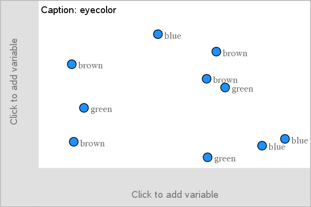
- | The new Data & Statistic work area displays a default caseplot with a caption, variable name, and unplotted data points for the variable. You can click the variable name in the caption to choose another variable for previewing, or drag a default data point toward an axis to plot the current variable. |
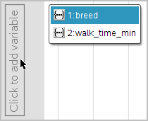
3. | Move near the center of either axis and click the Add List region. The list of variables displays. |
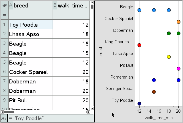
4. | Click the list that contains the categories you want to use for sorting data. |
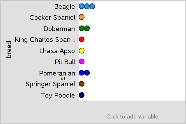
A dot chart plots in the work area. The application labels the axis with the variable name and shows a dot for each instance of a category.
5. | Explore the plotted data. |
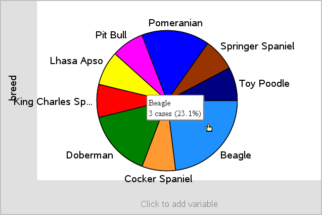
- | Hover over a dot in the plot to display data values. |
- | Click a dot to select it. Click the dot a second time to deselect it or remove it from a selection of multiple dots. |
- | Activate the Graph Trace tool and press ◄ or ► to move across the points in list order. Dots display a bold outline as you move across them in Trace mode. |
Like dot charts, bar charts display categorical data. The length of a bar represents the number of cases in the category.
1. | Click the Add Variable region of either axis and choose the name of a categorical variable. For more information, see Creating a Dot Chart. |
2. | On the Plot Types menu, click Bar Chart. |
The dot chart changes to a bar representation of the data.
3. | Explore the data in the plot. |
- | Hover over a bar to see a category summary (the number of cases and percentage among all categories). |
- | Activate the Graph Trace tool and press ◄ or ► move across the bars and view summary information. |
1. | On a new Data & Statistics page, create a bar chart with frequency or summary data by choosing Add X Variable on the Plot Properties menu. |
Note: You can also create a bar chart with frequency by selecting Add Variable with Summary List from the context menu of the Add Variable region of an axis.
2. | Select the desired variable from the pop-up choices. |
3. | Set the height of the bars with the summary variable by selecting Add Summary List from the Plot Properties menu. |
4. | Select the summary list from the pop-up choices. |
The bar chart plots on the work area. The icon in the lower left corner indicates that this plot was generated from summary data.
5. | Hover over a bar to see a category summary, or use the Graph Trace tool on the Analyze menu to move across all of the bars displaying the summaries. |
6. | (Optional) Add summary lists to create a comparative bar chart. |
A pie chart represents categorical data in a circular layout and uses an appropriately proportioned segment for each category.
1. | Create a dot chart on the work area. |
2. | On the Plot Types menu, click Pie Chart. |
The dots move by category into the segments of the pie chart.
3. | Hover over a segment to see the summary for the category, or use the Graph Trace tool on the Analyze menu to move across each segment displaying all of the summaries. The summary shows the number of cases for the category and the percentage among all cases. |
Note: You can switch to a pie chart from a bar chart generated from summary data.
This might be used to explore data in a two-way table.
1. | Type the raw data on a Lists & Spreadsheet page. |
2. | From the Insert menu in the toolbar, click Data & Statistics. |
Note: Your screen may differ, depending on the data you entered.
3. | Select the Click to add variable field, and select eyecolor as the variable for the x axis. |
4. | On the Plot Type menu, click Bar Chart. |
The frequency of the eyecolor data is plotted.
5. | To split the eyecolor data by gender, click the Plot Properties menu, click Split Categories by Variable, and then click gender. |
You can use a categorical split to sort the values plotted on an axis.
1. | Open a problem that includes a Lists & Spreadsheet page, or create data to be plotted in the Lists & Spreadsheet application. |
In this example, lists contain dog breed and daily walk information.
2. | Click column letter (B). |
3. | On the Lists & Spreadsheet Data menu, click the Quick Graph tool. |
The Quick Graph tool adds a Data & Statistics page. Data & Statistics plots the variable and labels the horizontal axis.
4. | To plot the numeric data for each category, hover on the Add Variable region near the center of the vertical axis and click the tooltip Click or Enter to add variable. |
The list of available variables displays.
5. | On the list of variables, click the name of the category variable. |
Data & Statistics labels the vertical axis and plots the numeric data for each category.