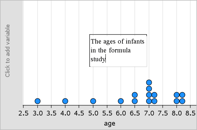
All data points for a plotted variable display in the same color to distinguish them from the data points of other variables. Data plotted by category and split plots are automatically displayed in different colors to help you distinguish the data.
To emphasize or distinguish certain parts of your work, you can change the default color for a variable’s data.
• | Apply fill colors to objects, such as shading, or change the color for a variable’s data points. |
• | Apply color to plotted lines (such as lines of regression) or movable lines. |
When using the computer software, you can insert an image as a background for a Data & Statistics page. The file format of the image can be .bmp, .jpg, or .png.
1. | From the Insert menu, click Image. |
2. | Navigate to the image that you want to insert. |
3. | Select it, and then click Open. |
The image is inserted as a background.
For more information, see the Working with Images chapter.
The Insert Text tool lets you type text to describe details related to plots on the work area.
4. | From the Actions menu, click Insert Text. |
A text box opens.
5. | Type notes or descriptions in the text box. |
6. | Customize the text to suit your needs. |
• | Move the pointer over the edges of the text box to drag the borders and change the width or height. |
• | Click and grab the text box to move it near objects that relate to the text. |
• | Scroll to view additional text in a box by clicking the arrows at the top and bottom edge. |
• | Click outside of the text entry box to exit the Text tool. |
• | Hide text by clicking the Actions menu and clicking Hide Text. |
• | Change the color of text. |