In this example, you create a summary table from raw data, and then use the table to generate a summary plot. For more information, see Using Data & Statistics.
|
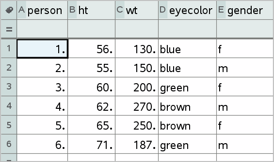
raw data
|
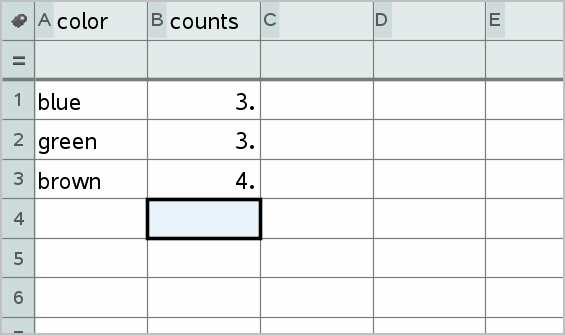
summary table for eye color based on raw data
|
A summary table contains an X (or Y) List and a Summary List.
|
•
|
The X (or Y) List contains numeric or string values (such as 1999 or “color”). Numeric values result in a histogram. String values identify the categories for a bar chart. |
|
•
|
The Summary List contains numeric values (such as count, frequency, or probability) for each element in the other list. |
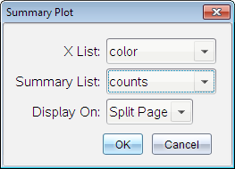
To Create a Summary Plot:
Note: For situations in which you already have a summary table, you can skip the first two steps.
|
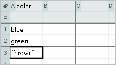
1.
|
Create a list that holds the category identifiers. For this example, name the list “color” and type strings for eye color. Enclose category names in quotes to prevent them from being interpreted as variables. |
|
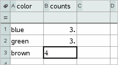
2.
|
Create the summary list. For this example, name the list “counts” and type the total count for each of the eye colors. |
|
3.
|
Select either list by clicking the top cell of the column and pressing ▲. |
|
4.
|
From the menu, select . |
The Summary Plot dialog box opens.
|
5.
|
If necessary, use and the arrow keys to select the correct lists for and . |
|
6.
|
In the field, select how to display the summary plot in the Data & Statistics application. |
|
•
|
Select to place the chart on half of the current page. |
|
•
|
Select to add the chart on a new page. |
The summary plot is displayed with the list names along the axes and a summary plot symbol in the lower left corner of the chart window.
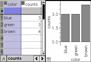
Note: In this example, the X List contains string data, so the summary plot displays as a bar chart. The category strings from the list display beneath the bars.
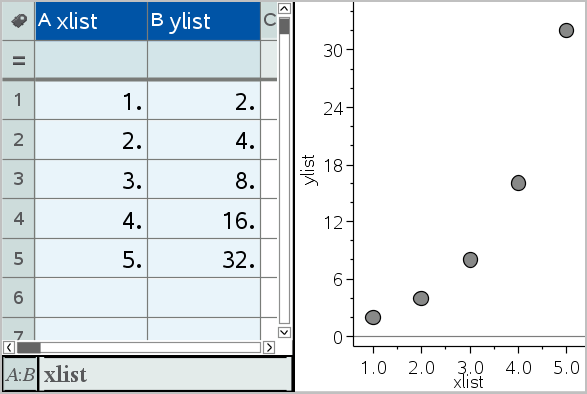
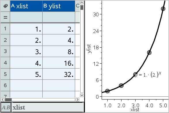
 Using Quick Graph