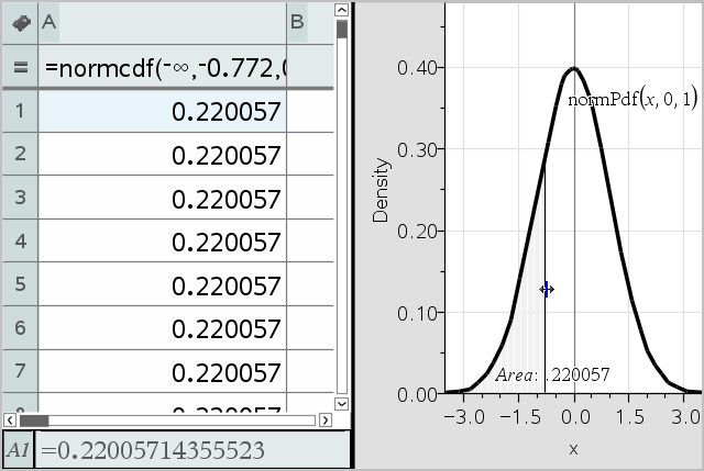
You can explore hypothesis tests and probability distributions in the Data & Statistics application after entering the data on a Lists & Spreadsheet page.
The following example uses the Draw option of the normCdf() function to plot a distribution model.
| 1. | On a Lists & Spreadsheet page, select the column-formula cell (second cell from the top) in column A. |
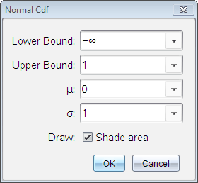
| 2. | From the Statistics menu, click Distributions, and click Normal Cdf. |
| 3. | Type the plot parameters into the Normal Cdf wizard. |
| 4. | Select the Draw check box to see the distribution plotted and shaded in Data & Statistics. |
Note: The Draw option is not available for all distributions.
| 5. | Click OK. |
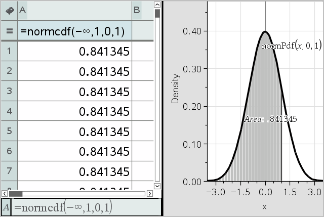
After drawing the plot in the previous example, you can explore the effect of changing the upper bound.
| ▶ | On the Data & Statistics plot, drag the vertical line that represents the upper bound toward the left or right. |
As you drag, the formula is updated and the shaded area is recalculated.