Plots can represent the data from a variable in a variety of ways. Choosing the appropriate plot can help you visualise the data. For example, you may be able to observe the shape and spread of the data in one plot type and another type may be useful for determining the best method for statistically evaluating data.
Dot plots, also known as dot-frequency plots, represent one-variable data. Dot plots are the default plot type for numeric data. When you plot a variable as a dot plot, one dot represents each value in the list. Each dot displays on the axis at a point that correspond to the value.
| 1. | To create a dot plot, click the Add Variable region in the center of an axis and click the name of a numeric variable. For more information, see Plotting Variables. |
| 2. | (Optional) To split a dot plot by category, click the Add Variable region on the other axis and choose the list that contains the corresponding category data. |
| 3. | (Optional) To plot multiple dot plots, choose Add X Variable on the Plot Properties menu and click a numeric variable from the list that displays. |
A second dot plot appears on the work area and the name of the plotted variable is added to both axis labels.
| 4. | Explore the plotted data. |
| - | Hover over a data point to display data values. |
| - | Drag a dot to move it. As you move a point, the values associated with it change on the work area display and in the list for the variable. |
| - | Activate the Graph Trace tool and press ◄ or ► to move across the data points in the plot in list order. Points enlarge and display a bold outline as you move across them in Trace mode. |
The Box Plot Tool plots one-variable data in a modified box plot. “Whiskers” extend from each end of the box, either to 1.5 times the interquartile range or to the end of the data, whichever comes first. Points that are a width of 1.5 * Interquartile Range past the quartiles plot individually, beyond the whiskers. These points are the potential outliers. When no outliers exist, x-min and x-max are the prompt for the end of each whisker.
Box plots are useful for comparing two or more sets of data that use the same scale. If a dataset is large, a box plot can also be useful in exploring data distribution.
| 1. | Click the Add Variable region in the centre of an axis. The default plot for one numeric variable is a dot plot. For more information, see Plotting Variables. |
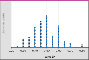
Note: If two variables are plotted in the work area, you can create a dot plot by removing one variable. Choose Remove X Variable or Remove Y Variable from the Plot Types menu.
| 2. | On the Plot Types menu, click Box Plot. |
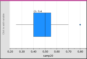
A modified box plot displays on the Data & Statistics work area.
Note: You can split a box plot by category by adding a list that contains corresponding categorical data to the y-axis.
| 3. | (Optional) To add additional variables for comparing box plots on the same axis, click Add X Variable on the Plot Properties menu. |
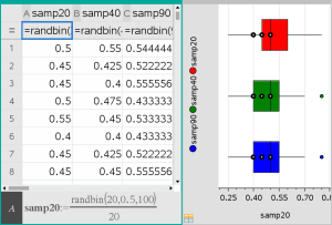
For example, you can use multiple box plots to compare the distributions of sample proportions. In the example, true proportion is .5 and sample size varies from n=20 to n=40 to n=90.
Notes:
| - | You can create a box plot with frequency by choosing Add X Variable or Add Y Variable on the Plot Properties menu. |
| - | You can specify a variable multiple times as you choose variables to plot as box plots. |
| - | The variable used to provide frequency information is added to the label on the horizontal axis in the format: |
| 4. | Point and click the regions of the box plot to explore and analyse the data it represents. |
| - | Hover over a region or over a whisker to display the details for the portion of the plot that interests you. The label for the quartile that corresponds to your selection is displayed. |
| - | Click a region of the box plot to select the data points or whiskers. Click again to remove the selection. |
| - | You can select any box plot that does not include frequency data and choose Dot Plot on the context menu to change the plot type. |
| - | Drag a selection to move it and explore other possibilities for the data. |
| - | Use the arrow keys to move a data point one pixel at a time. |
| - | Activate the Graph Trace tool and press ◄ or ► to move across dots and regions of the plot. As the trace cursor moves, the values for Q1, the median, Q3 and whisker ends/outliers are displayed. |
| 5. | Change the plot from a modified box plot to a standard box plot by choosing Extend Box Plot Whiskers on the Plot Properties menu. |
The box plot is redrawn as a standard box plot with extended whiskers.
The standard box plot’s whiskers use the minimum and maximum points in the variable and outliers are not identified. The whiskers on the plot extend from the minimum data point in the set (x-min) to the first quartile (Q1) and from the third quartile (Q3) to the maximum point (x-max). The box is defined by Q1, Med (median), and Q3.
Note: You can click Show Box Plot Outliers on the Plot Properties menu to return to the modified box plot.
A histogram plots one-variable data and depicts the distribution of data. The number of bins displayed depends on the number of data points and the distribution of these points. A value that occurs on the edge of a bin is counted in the bin to the right.
Creating a Histogram from Raw Data
| 1. | Create the list that you want to plot as a histogram. For example, you can enter or collect data as a named list on a Lists & Spreadsheet page. |
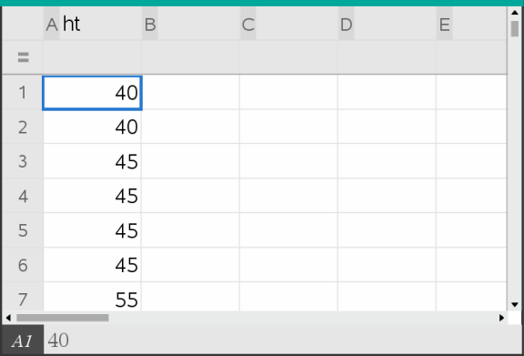
| 2. | On a Data & Statistics page, click the x or y axis, and select your list as the data to plot. |
| 3. | From the Plot Types menu, click Histogram. |
The data forms the bins of a histogram, with Frequency plotted by default on the unselected axis.
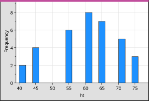
| 4. | Explore the data. |
| - | Hover over a bin to see the information for that bin. |
| - | Click a bin to select it. Click the bin again to deselect it. |
| - | Drag the side of a bin to adjust bin width and number of bins. |
Note: The bins are not adjustable in categorical plots or plots in which you choose variable bin widths.
| - | On the Analyse menu, click Graph Trace and press ◄ or ► to cycle through the bins and display their values. |
Adjusting the Histogram Scale of Raw Data
| 1. | On the Plot Properties menu, click Histogram Properties and choose Histogram Scale. |
| 2. | Choose the format for the scale of the histogram. |
| - | Frequency - displays data based upon the number of values that occur within each bin. This is the default data representation. |
| - | Percent - displays data in the histogram by each group’s percent value of the whole data set. |
| - | Density - displays data based upon the density of each group within the data set. |
Creating a Histogram with Frequency or Summary Data
| 1. | On a Lists & Spreadsheet page, create two lists: one containing the “bins”, such as heights in a population (ht), and the other containing the frequencies of those heights (freq). |
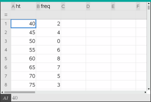
| 2. | On a Data & Statistics page, access the context menu on the x axis, and click Add X Variable with Summary List. |
| 3. | Select ht as the X List and freq as the Summary List. |
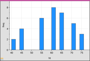
Note: It is up to you to set the data and bins in a meaningful way when using summary data.
Setting Equal Bin Widths
By default, bin widths are set to equal. You can specify the width and alignment of equal-width bins.
| 1. | On the Plot Properties menu, click Histogram Properties > Bin Settings and choose Equal Bin Width. |
The Equal Bin Width Settings dialogueue box opens.
| 2. | Type values to set Width and Alignment of the bins. |
| 3. | Click OK to apply the changes and redraw the bins. |
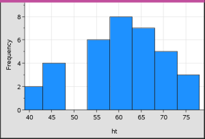
Both the data represented by the bins and the value you type for the alignment affect the placement of bins on the scale.
Setting Variable Bin Widths
You can set variable bin widths based on a list of bin boundaries.
| 1. | Create a named list containing boundary values. |
For example, a boundary list defined as {60,70,100,110} will create bins at 60 to 70, 70 to 100 and 100 to 110.
Note: The data must fall within the specified bin widths. For example, a data point of 115 would be outside the bins in the above list, and you would receive a Data/Bin Location Mismatch error.
| 2. | On the Plot Properties menu, click Histogram Properties > Bin Settings and choose Variable Bin Width. |
The Variable Bin Width Settings dialogue box opens.
| 3. | Select your boundary list as the List of Bin Boundaries. |
| 4. | Click OK to apply the changes and redraw the bins. |
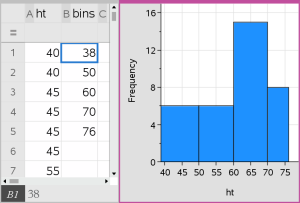
Note: You cannot change variable bin widths by dragging their boundaries; you must edit the list of boundaries or restore equal-width bins.
A normal probability plot shows one set of data against the corresponding quartile (z) of the standard normal distribution. You can use normal probability plots to judge the appropriateness of the normal model for your data.
| 1. | Choose or create the data you want to use for a normal probability plot. Use a named list from Lists & Spreadsheet or Calculator. |
| 2. | Plot the data in one of the following ways: |
| - | Create a dot plot by selecting a column and choosing Quick Graph. |
| - | Add a Data & Statistics work area. Click the Add Variable region on an axis and click the data list name to plot the variable. |
| 3. | On the Plot Types menu, click Normal Probability Plot. |
The data graphs in the Data & Statistics work area. You can examine the graph to compare the normal variable against the quartile.
| 4. | Explore the data represented in the normal probability plot. |
| - | Hover over a data point to display its value. |
| - | Click to select a data point. Click again to deselect it. |
| - | Click multiple data points to select them. |
| - | Activate the Graph Trace tool and press ◄ or ► to move across the data points and display values. |
A scatter plot shows the relationship between two sets of data. You can also plot a scatter plot by using the Quick Graph tool in the Lists & Spreadsheet application.
| 1. | In the Data & Statistics work area, click the Add Variable region and select the variable that contains the data you want to see represented on an axis. |
The plot of the selected variable displays on the axis.
| 2. | Click the Add Variable region of the other axis and select the variable containing the data you want to plot. |
The data points shift to represent the data in the selected variable.
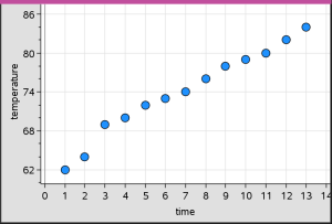
| 3. | Analyse and explore the data in the plot. |
| - | Click a point to select it. |
| - | Hover over a data point to view the summary data. |
| - | Work with the data using the available tools on the Analyse menu. For example, choose the Graph Trace tool and press ◄ or ► to move across the plot. |
| 4. | Optional: To plot additional lists against the x-axis, right-click the y-axis and click Add Variable. |
An X-Y line plot is a scatter plot in which the data points are plotted and connected in order of appearance in the two variables. Like scatter plots, these plots depict the relationship between two sets of data.
By convention, the left-most column of data is represented on the horizontal axis.
| 1. | Create a scatter plot. For more information, see Creating a Scatter Plot. |
| 2. | On the Plot Types menu, click the XY Line Plot tool. |
The data points within each set are connected to each other by a line.
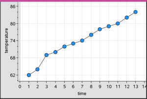
Note: The dots are connected in the order that they appear in the list variable on the horizontal axis. To change the order, use the sort tool in Lists & Spreadsheet.
| 3. | Analyse and explore the data in the plot. |
| - | Hover over a data point to view the summary data. |
| - | Work with the data using the available tools on the Analyse menu. For example, choose the Graph Trace tool and press the arrow keys to move across the dots in the plot and view the values. |
 Creating Dot Plots