You can manipulate and explore plotted data.
| 1. | Click and hold the desired point or bin. |
The pointer changes to an open hand ÷.
| 2. | Drag the point or bar to the new location and release it. Moving the point changes the values for x and y. |
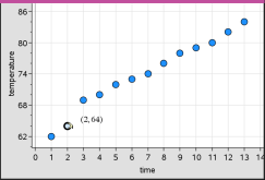
If you are working with data from Lists & Spreadsheet, the data that corresponds to the original point or bar automatically updates in the original column(s) in Lists & Spreadsheet as you move the point.
You can also move points or bins by changing the numbers in the Lists & Spreadsheet or Calculator applications. Data will update in all of the representations.
| 1. | Position the pointer over each data point that you want to select. When the pointer changes to an open hand ÷, click to add the point to the selection. |
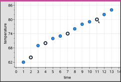
Alternatively, you can drag a selection rectangle around the points to select them.
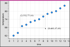
| 2. | Drag any of the selected points to move them all. |
Note: When a list is defined in Lists & Spreadsheet as a formula, the movement of points is restricted to positions that satisfy the formula.
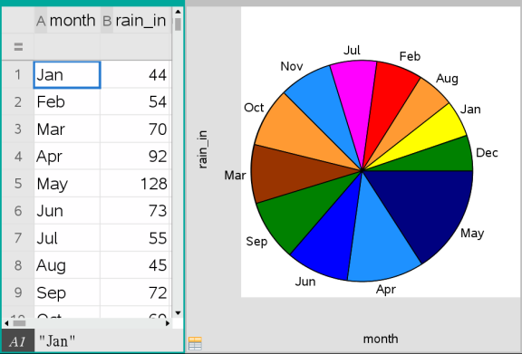
You can sort plotted categories in list order, value order or alphabetically by category name.
| 1. | Click the work area that contains the plotted data. |
| 2. | On the Actions menu, click Sort and then click the type of sort. |
|
|
Note: You can customise the order of the categories by clicking a label and dragging it.
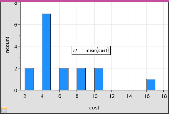
You can plot a value on an existing plot. It displays as a vertical line in the work area.
| 1. | From the Analyse menu, click Plot Value. |
A text box with a default expression opens in the work area.
|
|
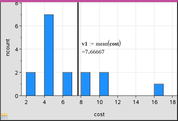
| 2. | Type the value you want to plot, and press Enter. In this example, the value is v1:= mean(cost). |
The line is drawn at that value, perpendicular to the axis. If you have multiple plots on the work area, a plot value segment displays for each plot.
Note: If you use a frequency table to generate a histogram, reference the frequency list in your expression. For example, type the expression "v1:= mean(List, FreqList)" in the plot value entry box.
| 3. | Click the line to display the value. |
Note: Double-click the value to edit the expression.
|
|
You can use Plot value for a single number or any expression that evaluates to a number. If the value is dependent on the data, like mean, when you drag a point or make changes in the Lists & Spreadsheet application, the line updates to reflect the change, allowing for investigation of the influence of points on the calculation.
| 1. | Select the plotted value line. |
| 2. | From the Actions menu, click Remove Plotted Value. |
You can change the plot type, to view different representations of data.
| ▶ | On the Plot Type menu, click a new plot type. Only the supported plot types are available. For example, only univariate plot types are available when a single variable plotted on an axis. |
The data representation changes to the new plot format.
Note: Options are unavailable on the menu if the plotted data cannot be represented by the plot type. For example, if a scatter plot is displayed in the work area, you cannot create a box plot without first removing the variable from the y-axis.
You can change the scale of the axes by using Translation and Dilation. The pointer changes to indicate whether Translation (ö) or Dilation (ô) is available in zones on the axes.
Translation
A translation slides a set of axes a fixed distance in a given direction. The original axes have the same shape and size.
| 1. | Position the pointer over a tick mark or label in the middle third of the axis. The pointer changes to ö. |
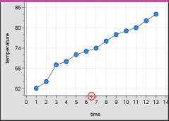
| 2. | Click to grab. The pointer changes to a grasping hand ù. Drag to the desired position and release. |
Dilation
Dilation retains the shape of the axes, but enlarges or reduces the size.
| 1. | Position the pointer over a tick mark or label near the ends of the axis. The pointer changes to ó on the vertical axis or ô on the horizontal axis. |
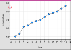
| 2. | Click to grab. The pointer changes to an open hand ÷. Drag to the desired position and release. |
You can add a movable line to a plot. Moving and rotating the line on the work area changes the function that describes it.
| ▶ | From the Analyse menu, click Add Movable Line. |
The movable line displays and is labelled with a function that describes it. For this example, Data & Statistics stores the expression for the movable line in the variable m1.
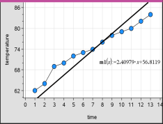
| 1. | Click and grab either end of the line. |
The pointer changes to é.
| 2. | Drag to rotate and change the slope of the line. |
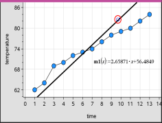
The function m1(x) is updated for the changes in the position of the movable line.
Changing the Intercept
| 1. | Click in the middle of the movable line. |
The pointer changes to ö.
| 2. | Drag to change the intercept. |
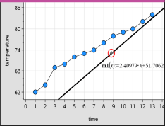
The number at the end of the equation changes to show the change in the intercept.
Note: The movable line is stored as a function that can be used for prediction in the Calculator application.
Locking the Intercept at Zero
You can lock the intercept of the movable line at zero.
| ▶ | From the Analyse menu, click Lock Intercept at Zero. |
You can unlock the intercept by choosing Unlock Movable Line Intercept on the Analyse menu.
You can trace a movable line to predict and analyse values.
| 1. | Click the line. |
The pointer changes.
| 2. | From the Analyse menu, click Graph Trace to enable Trace mode for the line. Rotation of the line is not supported in Trace mode. |
| 3. | Press ◄ or ► (left or right arrow keys) to trace the movable line. |
If the plotted variables change, points on the graph and the line are updated automatically.
You can show a line of regression when you have a scatter plot or an X-Y line plot on the work area. Studying the line of regression can help you understand the relationship between two variables.
| 1. | With a scatter plot or X-Y line plot of two variables on the work area, click the Analyse menu, choose Regression and view the list of regressions. |
| 2. | Click the type of regression line to show. For example, choose Show Linear (mx+b) to plot a linear regression line as shown in the following example. |
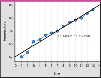
When the line of regression is selected, the expression for the line displays.
You can display residual squares on a plot. Residual squares can help you assess the appropriateness of the model for your data.
Note: This tool is only available when a regression or movable line is present in the work area.
| ▶ | From the Analyse menu, click Residuals > Show Residual Squares. |
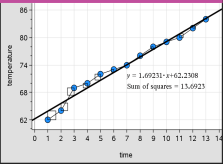
The sum of squares is updated as the line or data changes.
You can show a residual plot to determine how well a line fits data. The work area must include a scatter plot and one or more movable lines, regressions or plotted functions for Show Residual Plot to be available.
| ▶ | With a scatter plot, line of regression and/or movable line in the work area, click the Analyse menu and click Show Residual Plot > Residuals. |
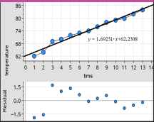
Notes:
| • | With multiple regressions or functions and movable lines plotted, you can select each by clicking the line to show its residual plot. |
| • | Click and hold a dot on the residual plot to see the residual. |
| • | The residual plot for the selected regression or function displays in the work area. |
| • | For consistency in comparing sets of data, residual plots do not rescale when you move from one function or regression to another. |
| • | Select a function or regression before a showing residual plot. If no function or regression is selected and there are several plotted, Data & Statistics arbitrarily selects the function or regression for showing the residual plot. |
| • | Axes can be adjusted by clicking and dragging. |
| ▶ | With a scatter plot, line of regression and/or movable line in the work area, click the Analyse menu, and click Hide Residual Plot. |
 Moving Points or Bins of Data