You can customize the Graph view by adding a title, changing colors, and setting ranges for the axis.
When you add a title to a graph, the title is displayed in the View Details area. When you print the graph, the title prints on the graph.
| 1. | Click Graph > Graph Title. |
The Graph Title dialog box opens.

If there are two graphs in the work area, the dialog box has two title options.

| 2. | Type the name of the graph in the Title field. |
—or—
| a) | Type the name of the first graph in the Graph 1 field. |
| b) | Type the name of the second graph in the Graph 2 field. |
| 3. | Select Enable to show the title. |
Note: Use the Enable option to hide or show the graph title as needed.
| 4. | Click OK. |
The title is shown.
Setting Axis Ranges for One Graph
To modify the minimum and maximum range for the x and y axis:
| 1. | Click Graph > Window Settings. |
The Window Settings dialog box opens.
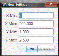
| 2. | Type the new values in one or more of these fields: |
| - | X Min |
| - | X Max |
| - | Y Min |
| - | Y Max |
| 3. | Click OK. |
The application uses the new values for the graph visual range until you modify the range or change data sets.
Setting Axis Ranges for Two Graphs
When working with two graphs, enter two y axis minimum and maximum values, but only one set of minimum and maximum values for the x axis.
| 1. | Click Graph > Window Setting. |
The Window Setting dialog box opens.
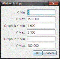
| 2. | Type the new values in one or more of these fields: |
| - | X Min |
| - | X Max |
| - | Graph 1: Y Min |
| - | Y Max |
| - | Graph 2: Y Min |
| - | Y Max |
| 3. | Click OK. |
The application uses the new values for the graph visual range until you modify the range or change data sets.
Setting the Axis Range on the Graph Screen
You can modify the minimum and maximum range for the x and y axes directly on the graph screen.
| ▶ | Select the axis value that you want to change, and type a new value. |

The graph is redrawn to reflect the change.
| 1. | In the Detail view on the left, click the tab immediately below the view selection buttons. |
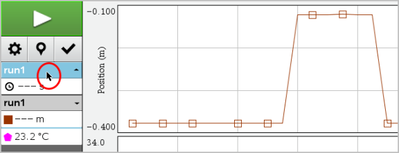
| 2. | The Detail view shows a list of available data sets. |
| 3. | Use the check boxes to select the data sets to plot. |
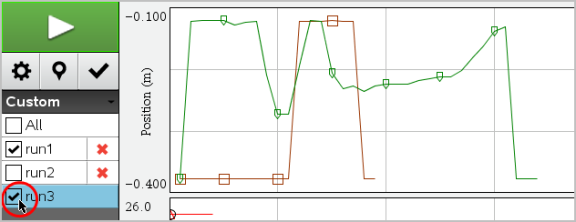
Use the autoscale option to show all the points plotted. Autoscale Now is useful after you change the x and y axis range or zoom in or out of a graph. You can also define the automatic autoscale setting to use during and after a collection.
Autoscale Now Using the Application Menu
| ▶ | Click Graph > Autoscale Now. |
The graph now displays all the points plotted.
Autoscale Now Using the Context Menu
| 1. | Open the context menu in the graph area. |
| 2. | Click Window/Zoom > Autoscale Now. |
The graph now displays all the points plotted.
Defining Autoscale During a Collection
There are two options for using the automatic autoscaling that occurs during a collection. To choose an option:
| 1. | Click Options > Autoscale Settings. |
The Autoscale Settings dialog box opens.
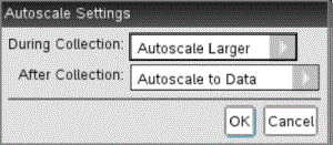
| 2. | Click ► to open the During Collection drop-down list. |
| 3. | Select one of these options: |
| • | Autoscale Larger - Expands the graph as needed to show all points as you collect them. |
| • | Do Not Autoscale - The graph is not changed during a collection. |
| 4. | Click OK to save the setting. |
Defining Autoscale After a Collection
You have three options for setting the automatic autoscaling that occurs after a collection. To set your choice:
| 1. | Click Options > Autoscale Settings. |
The Autoscale Settings dialog box opens.
| 2. | Click ► to open the After Collection drop-down list. |
| 3. | Select one of these options: |
| • | Autoscale to Data. Expands the graph to show all data points. This option is the default mode. |
| • | Autoscale From Zero. Modifies the graph so all data points including the origin point are displayed. |
| • | Do Not Autoscale. The graph settings are not changed. |
| 4. | Click OK to save the setting. |
Selecting a range of data on the graph is useful in several situations, such as when zooming in or out, striking and unstriking data, and examining settings.
To select a range:
| 1. | Drag across the graph. |
The selected area is indicated by gray shading.
| 2. | Perform one of these actions. |
| • | Zoom in or out |
| • | Strike or unstrike data |
| • | Examine settings |
To deselect a range:
| ▶ | Press the Esc key as necessary to remove the shading and the vertical trace line. |
You can zoom in on a subset of the collected points. You can also zoom out from a previous zoom or expand the graph window beyond the data points collected.
To zoom in on a graph:
| 1. | Select the area you want to zoom into, or use the current view. |
| 2. | Click Graph > Zoom In. |
The graph adjusts to display only the area you selected.
The x range selected is used as the new x range. The y range autoscales to show all graphed data points in the selected range.
| ▶ | Select Graph > Zoom Out. |
The graph is now expanded.
If a Zoom In precedes a Zoom Out, the graph displays the original settings prior to the Zoom In.
For example, if you Zoomed In twice, the first Zoom Out would display the window of the first Zoom In. To display the full graph with all data points from multiple zoom ins, use Autoscale Now.
To indicate how often marks show on the graph and whether to use a connecting line:
| 1. | Click Options > Point Options. |
The Point Options dialog box opens.
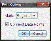
| 2. | Select a Mark option from the drop-down list. |
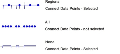
| • | None. No point protectors. |
| • | Regional. Periodic point protectors. |
| • | All. Every data point as a point protector. |
| 3. | Select Connect Data Points to display a line between points. |
—or—
Clear Connect Data Points to remove the line between points.
The following graphics show examples of some of the Point Mark options.
| 1. | Click the point indicator for the graph whose color you want to change. |
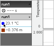
| 2. | In the Column Options dialog box, select the new Color. |
| 1. | Right-click in the graph to open the menu. |
| 2. | Click Point Marker. |
Note: If there is only one dependent variable column, the Point Marker option is preceded by the data set name and column name. Otherwise, the Point Marker option has a menu.
| 3. | Select the column variable to change. |
| 4. | Select the point marker to set. |
The Point Marker changes to the option selected.
Use the option Select X-axis Column to select the column used as the independent variable when graphing the data. This column is used for all graphs.
| 1. | Click Graph > Select X-axis Column. |
| 2. | Select the variable you want to change. |
The x-axis label on the graph changes and the graph is reordered using the new independent variable for graphing the data.
Use the option Select Y-axis Column to select which dependent variable columns to plot on the displayed graph(s).
| 1. | Click Graph > Select Y-axis Column. |
| 2. | Select one of the following: |
| • | A variable from the list. The list is a combination of dependent variables and the number of data sets. |
| • | More. Selecting More opens the Select dialog box. Use this when you want to select a combination of data set variables to graph. |
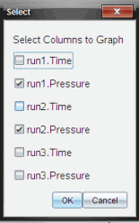
You can hide or show the Details view on the left side of the screen.
| ▶ | Click Options > Hide Details or Options > Show Details. |
You can hide or show the axes tick labels on a graph.
| ▶ | Click Options > Hide tick labels or Options > Show tick labels. |
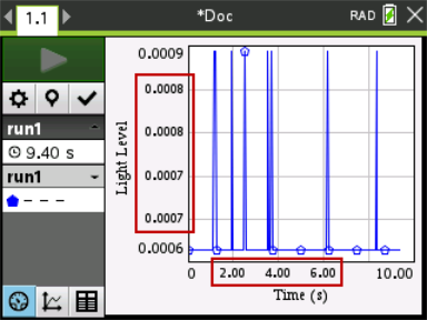
Notes:
| • | When a Vernier DataQuest™ application is added to a document, the tick labels will default to being displayed. |
| • | Tick labels may not be displayed if there is a lack of available space. Minimum and maximum values will always be displayed. |
| • | Tick labels cannot be edited, but they will recalculate as needed if the minimum or maximum values are edited or the window settings are changed. |
 Adding a Title